Welcome back to
Chart Tools week here on the blog, where we're continuing our overview of generating charts for your AdSense reporting with
Google Chart Tools. Today we’ll examine how to generate two other types of charts: a table chart and a geo chart.
Table chart
The third chart requested by our CEO is a
table chart. The table chart will contain the number of ad requests, the number of matched ad requests, and the number of individual ad impressions broken down by ad client ID.
Our request will have these parameters:
| start date: |
2011-01-01 |
| end date: |
2011-12-31 |
| dimensions: |
AD_CLIENT_ID |
| metrics: |
AD_REQUESTS, MATCHED_AD_REQUESTS, INDIVIDUAL_AD_IMPRESSIONS |
| filters: |
(none) |
And the result will be similar to:
result = {
  "kind": "adsense#report",
  "totalMatchedRows": "4",
  "headers": [ {...} ],
  "rows": [
    ["ca-afdo-pub-1234567890123456", "59", "55", "232"],
    ...
    ["partner-mb-pub-1234567890123456", "1", "0", "0"]
  ],
  "totals": ["", "278", "264", "825"],
  "averages": ["", "69", "66", "206"]
}
As usual, let’s create a
DataTable and a
DataView to perform transformations on columns:
var data = new google.visualization.arrayToDataTable([['Ad client id',
    'AD_REQUESTS', 'MATCHED_AD_REQUESTS', 'INDIVIDUAL_AD_IMPRESSIONS']]
    .concat(resp.rows));
var view = new google.visualization.DataView(data);
view.setColumns([
  0,
  {calc:function(dataTable, rowNum) {return parseInt(dataTable.getValue(
      rowNum, 1))}, type:'number', label:'Ad requests'},
  {calc:function(dataTable, rowNum) {return parseInt(dataTable.getValue(
      rowNum, 2))}, type:'number', label:'Matched ad requests'},
  {calc:function(dataTable, rowNum) {return parseInt(dataTable.getValue(
      rowNum, 3))}, type:'number', label:'Individual ad impressions'}
]);
Finally, let’s draw the table chart. Note that there is no title for a table chart: if you need one, you’ll have to add it in a different element.
var tableWrapper = new google.visualization.ChartWrapper({
  chartType: 'Table',
  dataTable: view,
  containerId: 'vis_div'
});
tableWrapper.draw();
The table chart for our CEO is ready, and it can be sorted and paged.
Check the
live example and the
source code for today!
Geo chart
Finally, the last chart requested from our CEO: a
geo chart. The geo chart will show the number of page views for the year broken down by country name.
Our request will have these parameters:
| start date: |
2011-01-01 |
| end date: |
2011-12-31 |
| dimensions: |
COUNTRY_NAME |
| metrics: |
PAGE_VIEWS |
| filters: |
(none) |
And the result will be similar to:
result = {
  "kind": "adsense#report",
  "totalMatchedRows": "9",
  "headers": [ {...} ],
  "rows": [
    ["Canada", "1"],
    ...
    ["United States", "52"]
  ],
  "totals": ["", "241"],
  "averages": ["", "26"],
}
DataTable and
DataView creation step:
var data = new google.visualization.arrayToDataTable(
          [['Country', 'Page Views']].concat(resp.rows));

var view = new google.visualization.DataView(data);
view.setColumns([
  0,
  {calc:function(dataTable, rowNum) {return parseInt(dataTable.getValue(
      rowNum, 1))}, type:'number', label:'Page views'}
]);
Now we can draw the geo chart. For the geo chart there is no title:
var geoChartWrapper = new google.visualization.ChartWrapper({
  chartType: 'GeoChart',
  dataTable: view,
  containerId: 'vis_div'
});
geoChartWrapper.draw();
Et voilà! We have a map of the world with colors and values assigned to specific countries representing the page views from the countries for the current year.
Check the
live example and the
source code for today.
Time to play!
Eager to try to see what you can do combining these two powerful Google APIs?
You can start immediately using our
Google API Explorer and our
Google Visualization PlayGround. You can use the Explorer to query our AdSense Management API, and then use the results inside the code on the Visualization PlayGround to generate a chart.
In the next and final part of this series, we will see how to assemble multiple charts into dashboards and enrich them with interactive controls to manipulate the data they display.
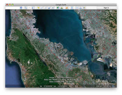 Search in Google Earth is much more than a pretty face, though. Just beneath the surface lies the powerful KML language, which you can use to take full control of your searches. Right-click on any search listing to save it to My Places or copy it as KML text, or click one of the icons below the search results to save or copy everything all at once. Save your walking directions to My Places and start a tour of the route to get turn-by-turn directions from the comfort of your chair. You can also click on “History” below the search field to see all of your recent searches at once, and selectively hide and show results to get, say, a picture of the top ten hotels and crêpe restaurants in Paris, for optimal crêpe-eating efficiency.
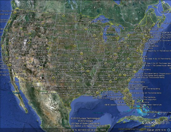
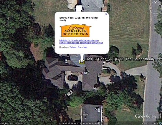 What I found remarkable was the consistent spread of homes across the United States. I don't know if the producers intentionally tried to reach every corner of the country, but that's certainly what happened.
 To see it for yourself, you can
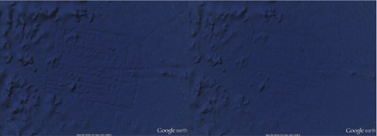
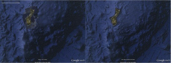 Another noteworthy change is that "Atlantis" is now gone. A few years ago some people thought they had found the lost city of Atlantis, but it turned out to simply be
  To see more of what's changed, Google has created this short video to give you a tour:
Combined with the new patchless imagery, the earth is suddenly looking remarkably better all the way around. For more, check out

