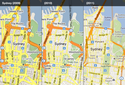
“…Some highlights to look out for are a brighter and more cheerful colour palette, a more integrated and less visually noisy labelling style, subtle improvements to footpaths and minor roads, and cleaner building and land parcel rendering.”
One thing Google cannot be accused of is that it does not put continuous efforts into upgrading of its products and services. In fact, that constant tinkering with features and functionality gives an impression that all Google products are in a permanent state of development. With Google we never know what functionality is coming and when it will be available, or whether the product or service will survive in the long run as the company is not afraid to pull down underperforming applications. The most recent announcement is the closure of Google Labs with 56 experimental products. Product-specific Labs sites, like Gmail Labs, Google Maps Labs and Search Experiments, aren't affected by the decision.
First spotted on Google Maps Mania
No comments:
Post a Comment