Perhaps the most famous disease map is the spot map created by John Snow in 1854. Snow created his map to plot an outbreak of cholera in Soho, London. The map helped to prove that the Soho outbreak of the disease was caused by water that came from one pump in Broad Street.
The dominant theory at the time was that cholera was caused by "bad air", so John Snow's map helped to prove that water was the true cause of the disease.
This video gives a good account of what John Snow's map making achieved,

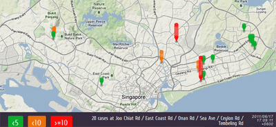
WaetherLah has created this Google Map to track cases of Dengue Fever in Singapore. The map uses dynamic map markers to show the number of cases reported at different locations in the city-state.
Google also has a Dengue Trends website that uses a number of search terms as indicators of dengue activity. Google Dengue Trends uses aggregated Google search data to estimate dengue activity and then creates a heat-map to display locations where there is currently likely to be high Dengue activity.
HealthMap is a Google Maps based application that plots real-time worldwide infectious disease outbreaks from around the world.
The map gathers data from disparate sources, including online news aggregators, eyewitness reports, expert-curated discussions and validated official reports.

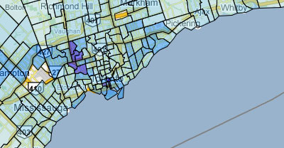
Back in 2009 the Toronto Star created five different Google Maps showing the rates of Chlamydia, Gonorrhoea, HIV, Infectious Syphilis and Other Syphilis in different neighbourhoods in the city. The data for the maps was supplied by the Ministry of Health in response to a freedom of information request.
A good analysis of the maps is available on the Toronto Star's website here. It would be interesting, to see these maps in conjunction with other data, such as average income, levels of health insurance etc.
Also See
Mapping Swine Flu - a round-up of the outbreak of mapping following the Swine Flu epidemic in 2009
No comments:
Post a Comment