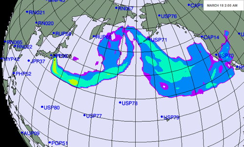
 But the map was not just hypothetical, it was downright irresponsible, because its scale was completely arbitrary and relative (see the key at right). In other words, there is no way of telling whether the radiation being depicted was extremely minor (say, a banana’s worth) or something more severe — whether we’re dealing with microsieverts or millisieverts.
The forecast was meant to show dispersal patterns as an aid to radiation monitoring, and in that context this map is useful. But that’s a little too subtle for public consumption, and this map has been widely circulated. When people have been panicking beyond all reason and sense, it’s not enough to say, on the right side of the map, that “[h]ealth and nuclear experts emphasize that any plume will be diluted as it travels and, at worst, would have extremely minor health consequences in the United States” — people will see that plume on the map and freak. OMG it’s coming to get us!
No comments:
Post a Comment